For online retailers, your eCommerce site is one of your most valuable assets. An easy-to-browse site can help draw in customers and guide them to the products they need. A site that’s hard to navigate can encourage customers to look elsewhere, however.
Simple upgrades can have a major impact on site usability. Before next year, consider modernizing your site with these changes.
1. Include Important Business Information
If customers have a question about your business, can they find an answer on your website? Most eCommerce sites offer some key business info in easy-to-find pages. Information on store hours, shipping information, discounts, promotions and rewards programs should all be easy to find.
A robust FAQ section can help you provide most of this information. You may also want a separate page for details on shipping costs and timelines. Contact information will also be essential — many businesses provide both an email and a contact form for customers who need to get in touch.
2. Offer Categories and Filter Options
Choice of filter options can make an eCommerce site much easier to navigate. The right filter can help a customer narrow down the options to find the perfect item for their needs.
However, 32% of online retailers don’t offer the option to filter by category — potentially making browsing much harder for potential customers.

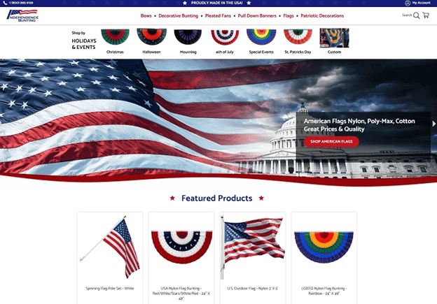
This page, from Independence Bunting, a bunting retailer, shows how categories can help customers find products quicker effectively.
Their selection of buntings is organized by major holidays and events, providing a direct link to filtered product listings. The site also displays some featured products, also helping to steer customers in the right direction.
3. Streamline Navigation With Headers
eCommerce sites need to be easy to navigate, no matter which page a user is on. Navigation headers or sidebars, which can be present on every page, provide visitors with a site map they can access any time they get lost or want to look for something else.
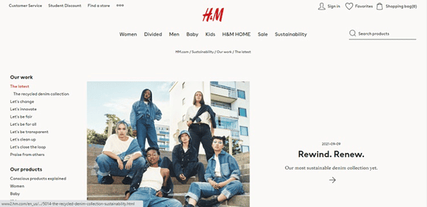
For an example of a great navigation header, see this page from the ecommerce site of clothing retailer H&M.

This site uses two navigation headers, one for product categories and another for support resources — customer service, discount info and store locations.
The combination of these headers ensures that customers can quickly move around the site from any page — moving from category to category or learning more about the business’s sustainability programs as they like.
Each of the main category links expands when hovered over, providing additional options to customers without taking up too much screen space.
Offering headers like these can streamline site navigation and direct customers to the items they’re looking for.
4. Provide Social Proof and User Reviews
When deciding whether or not to buy a product, customers often go looking for reviews. Information from other users about their experiences with an item can help customers decide if a product is right for them.
User review sections allow customers to leave reviews on products — providing you with powerful marketing tools in the form of customer descriptions of products and positive product reviews.
Including a review section on your website can also help to make your business seem much more trustworthy.
These Upgrades Will Help Your eCommerce Site in 2022
Simple changes to your site can make it much more attractive to potential customers.
Streamlining access to essential business information, upgrading your filter options and offering social proof can all help encourage customers to browse your site and make purchases.


